In this post, Marketing Director Cindy Hohman takes a look back on 30+ years of Festival logos to explore where our brand came from and where it’s heading next.
![]() Many of you likely remember that the Festival produced a beautiful, themed poster or art print for each summer season. The name of the Festival was always in a different font or different style to match the design of the poster. In that sense, the posters were more for the sake of art than for presenting a consistent brand identity. A logo was rarely seen on these prints, but I was able to find historical logos in a recent dig into our historical documents.
Many of you likely remember that the Festival produced a beautiful, themed poster or art print for each summer season. The name of the Festival was always in a different font or different style to match the design of the poster. In that sense, the posters were more for the sake of art than for presenting a consistent brand identity. A logo was rarely seen on these prints, but I was able to find historical logos in a recent dig into our historical documents.
While I look forward to sharing the aforementioned poster art with you in the future, because we’ve just unveiled a new Festival brand and logo, I’m going to focus on that today.
1977-1993
Cindy: In my recent dive into Festival archives, I spotted some version of this logo, used for the Festival from 1977 to 1993. Although the font used changed a little or a lot from year to year, the string instrument icon remained in some way until the early 2000s.
1987
Cindy: 1987 season materials demonstrated the first, steady use of one logo. I found this version of the logo in a 1987 newspaper ad. The font used here is very traditional and still popular today. This marked the first of many seasons for which this logo was used.
1994-2003
Cindy: I found this logo on the top of a brochure from 1994. By this time, the logo had changed to include a drawing of the Flatirons, which was obviously to signify the location of the Festival.
2004-2008
Cindy: The Colorado Music Festival logo was redesigned around the time of the Festival’s 30th anniversary. Although the logo used the historic, traditional font, this new design was much more modern.
2009-2010
Cindy: When the Colorado Music Festival and the Rocky Mountain Center for Musical Arts merged, a temporary logo was created that combined the two organizations’ names into one logo using a musical clef as the icon. You can see that the traditional font is still being carried forward.
2011-2018
Cindy: Once the organization’s official name was determined — Colorado Music Festival & Center for Musical Arts — the combined logo was refined with a new, modern font and warm color palette. The combined logo was used until 2019, at which time it was clear that the Festival needed a separate identity from the Center.
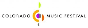
2019-2020
Cindy: With the appointment of Peter Oundjian as Music Director, the Festival and Center began using separate logos. Although both still used the clef icon, the Festival’s logo was revised to a warm gray to communicate a more elegant and sophisticated aesthetic.
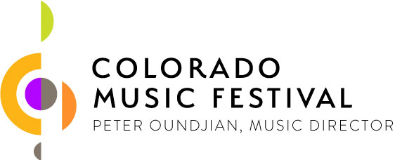
Today
Cindy: After a lengthy process of research, strategy, design, and review, the new Colorado Music Festival logo was determined. This logo represents the vision of the Festival, which is to be an organization that highlights artistry, strength, and vision for the future. Note the “CO” in the design, reflective of the state’s iconic flag design.
This brand refresh, as we like to call it, would not have been possible without the expertise of several committed volunteers, the commitment of our staff, a talented graphic designer, and the support of the Board of Directors.
We hope you love it as much as we do!